
Sabdita Fashion is an online women’s clothing business specializing in custom-made dresses for style-conscious customers. The brand combines contemporary fashion with elegance, individuality, and wearable comfort.
Marketorr rebranded Sabdita Fashion with a minimalist identity designed for both fashion products and customer-facing communication. The system includes brand positioning, an “S + F” monogram, logo variations, typography, colour direction, brand messaging, packaging, thank-you cards, envelopes, ribbons, hang tags, shopping bags, billboard design, campaign graphics, and logo animation.
The published Behance presentation describes the project as a complete rebranding exercise focused on modern minimalism and the expectations of today’s fashion-conscious woman.
Project Overview
Sabdita Fashion creates custom-made dresses for young women who want clothing that feels modern, elegant, and personal.
The previous brand presentation needed a clearer visual direction that could connect the products, packaging, advertising, and digital communication. A fashion business cannot rely on product photography alone. Its logo, messaging, colours, typography, packaging, and campaign materials must create one recognizable experience.
Marketorr developed the new identity around three characteristics:
- Modern femininity
- Minimal visual structure
- Sophisticated fashion presentation
The completed system positions Sabdita Fashion as a contemporary women’s clothing brand rather than a general online clothing seller.
The Rebranding Challenge
Women’s fashion is a visually competitive market. Many clothing businesses use similar scripts, floral icons, silhouettes, hangers, crowns, dresses, or fashion illustrations in their logos.
These familiar elements communicate the product category, but they can also make different brands appear interchangeable.
Sabdita Fashion needed a rebranding system that could:
- Represent women’s fashion without using a generic dress illustration
- Connect the logo directly with the Sabdita Fashion name
- Appeal to young, fashion-conscious women
- Communicate elegance without appearing overly ornamental
- Present custom-made clothing in a more contemporary way
- Remain recognizable on product packaging and small garment labels
- Work across printed, digital, physical, and animated applications
- Support seasonal collections and campaign photography
- Create consistency between products, packaging, advertising, and social media
- Remain legible on light, dark, photographic, and coloured backgrounds
- Provide a compact symbol for profile images and product identification
- Give the brand a clearer message beyond individual dress designs
The rebranding also needed enough flexibility to support different collections without changing the fundamental identity.
Our Rebranding Strategy
Marketorr based the new identity on the initials of the company name.
The letter “S” represents Sabdita, while “F” represents Fashion. The two letters were simplified and combined into one minimalist monogram. This approach gives the identity a direct connection with the brand name without depending on an unrelated fashion symbol.
The visual direction was kept clean and restrained. Fashion photography introduces personality, movement, fabric, and seasonal context. The logo provides the consistent signature that connects those changing images.
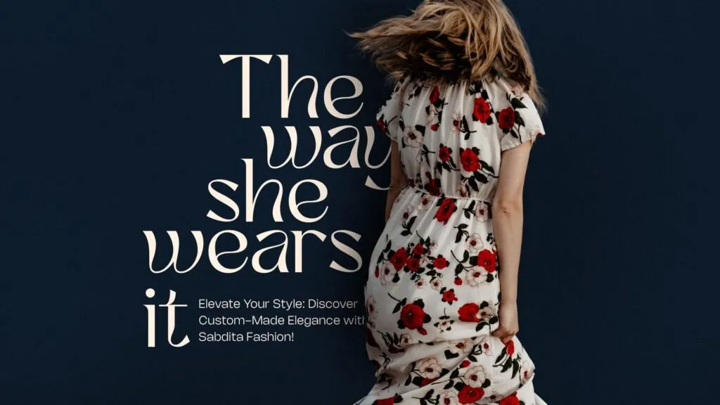
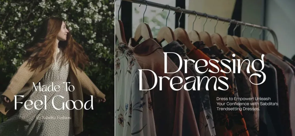
The identity was also developed around an emotional customer proposition. Messages such as “Made To Feel Good” connect clothing with confidence and personal experience, while “The way she wears it” places attention on the woman wearing the product.
This creates a brand system that presents fashion as both a product and a form of individual expression.
What Marketorr Delivered
Brand Positioning
Marketorr defined Sabdita Fashion as a modern women’s clothing brand offering trendy yet elegant custom-made dresses.
The positioning focuses on women who care about personal style and want their clothing to feel contemporary, comfortable, and expressive.
This direction helped establish the visual principles used throughout the identity:
- Clean rather than decorative
- Elegant rather than formal
- Feminine without relying on clichés
- Contemporary rather than trend-dependent
- Aspirational while remaining approachable
- Product-focused but emotionally relevant
The brand positioning provides a consistent foundation for design, photography, messaging, packaging, and campaign communication.
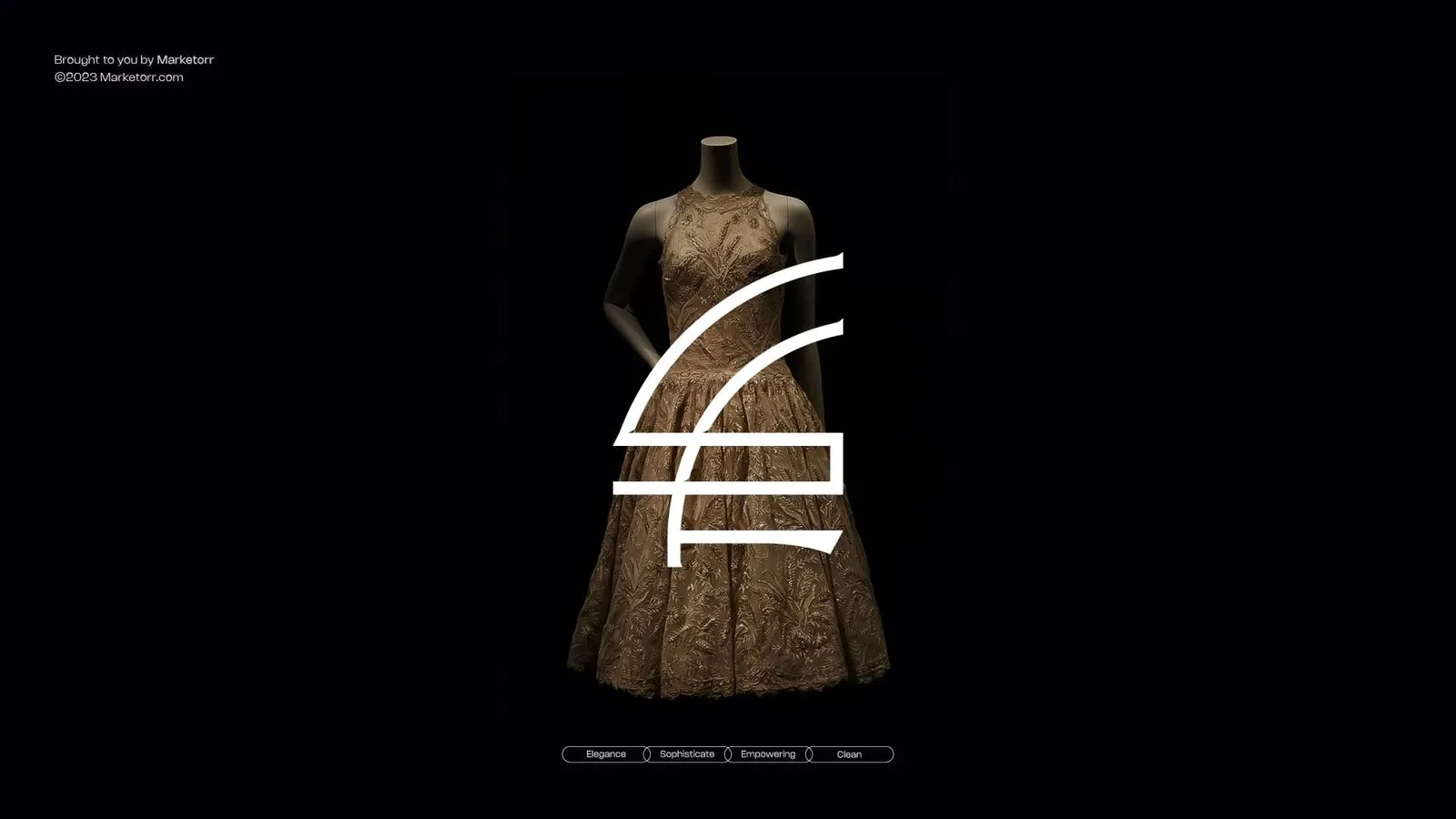
Custom “S + F” Monogram
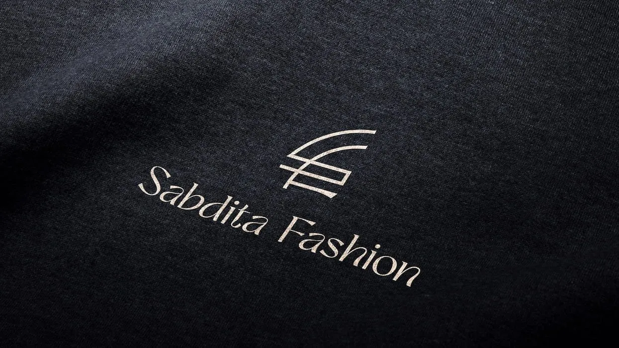
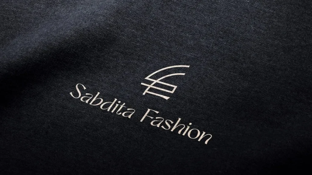
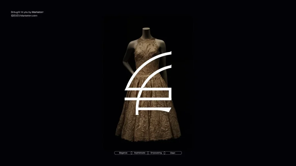
The primary symbol combines the letters “S” and “F” into one minimalist mark.
According to the Sabdita Fashion logo presentation on Dribbble, the monogram was created specifically around the initials of Sabdita Fashion.
The combined mark creates a compact visual signature that can function independently from the complete company name.
It can be applied across:
- Garment labels
- Hang tags
- Packaging boxes
- Shopping bags
- Fabric ribbons
- Thank-you cards
- Social-media profile images
- Website favicons
- Collection graphics
- Product stickers
- Promotional materials
- Video end frames
The simplified form helps the symbol remain identifiable when reproduced at reduced sizes.
Logo Rationale
The logo concept follows a direct structure:
- The letter “S” represents Sabdita.
- The letter “F” represents Fashion.
- The two letters are integrated into one monogram.
- The combined symbol creates the primary brand signature.
This rationale makes the identity easier to explain to customers, employees, packaging suppliers, printers, designers, and marketing partners.
It also gives the symbol a clear relationship with the company name instead of depending on an abstract fashion icon with no specific meaning.
Complete Logo Lockup
The identity includes both the standalone monogram and the complete Sabdita Fashion name.
The monogram provides quick visual recognition. The wordmark identifies the company clearly when the brand appears in front of new customers.
The complete lockup is suitable for:
- Website headers
- Product packaging
- Social-media covers
- Fashion campaigns
- Collection catalogues
- Delivery materials
- Billboard advertising
- Corporate communication
- Digital advertisements
- Branded stationery
The standalone symbol offers a compact alternative for small or restricted spaces.
Logo Scale and Proportion
Marketorr demonstrated how the logo should maintain its shape and visual balance across different sizes.
Scale control is particularly important for a clothing brand because the same identity may appear on a large billboard and a small garment tag.
The proportional system protects:
- The relationship between the “S” and “F”
- The spacing inside the monogram
- The position of the symbol beside the name
- The minimum readable size
- The space surrounding the logo
- The balance between the monogram and wordmark
These controls help prevent the identity from being stretched, compressed, crowded, or reconstructed incorrectly.
Light and Dark Logo Applications
The logo was presented across different background environments.
A dark navy version provides contrast on white and lighter surfaces. White or reversed versions support dark layouts, fashion photography, packaging, and advertising.
The identity can therefore remain consistent across:
- White packaging
- Navy packaging
- Fabric surfaces
- Product photography
- Outdoor advertising
- Social-media graphics
- Printed stationery
- Promotional displays
The structure remains unchanged while the colour treatment adapts to the background.
Navy-Led Colour Direction
The identity uses a restrained, navy-led colour environment supported by white and neutral surfaces.
Navy gives the brand a composed and sophisticated appearance. White creates visual space and keeps product photography, messaging, and packaging layouts clear.
The palette avoids depending entirely on pink, purple, or other colours frequently used in women’s fashion branding.
This makes the identity suitable for multiple dress collections, seasonal campaigns, packaging types, and photographic styles.
The colour system can support:
- Primary logo applications
- Packaging backgrounds
- Printed inserts
- Website interfaces
- Social-media templates
- Campaign headlines
- Outdoor advertising
- Garment identification
- Promotional materials
Exact HEX, RGB, CMYK, and print specifications should be added to the formal brand guidelines before production.
Refined Typography
The visual presentation uses refined, fashion-led typography with restrained supporting text.
Display typography creates an editorial feeling for campaign statements and collection messages. Supporting typography keeps product information, customer instructions, addresses, and packaging details readable.
The typography system can create hierarchy across:
- Campaign headlines
- Product names
- Collection names
- Size and care information
- Packaging messages
- Thank-you cards
- Social-media captions
- Website sections
- Promotional advertisements
Maintaining the same typography across these applications helps customers connect separate materials with the same fashion brand.
Brand Messaging
Marketorr extended the identity beyond visual elements by demonstrating how the brand could communicate through short fashion-focused messages.
The presentation includes the statement:
Made To Feel Good
This message connects the clothing with the customer’s emotional experience. It suggests that the purpose of the dress is not limited to appearance. The clothing should also support comfort, confidence, and personal expression.
Another campaign application uses:
The way she wears it
This line places the customer at the centre of the communication. It recognizes that the same garment can become personal through the way an individual styles and experiences it.
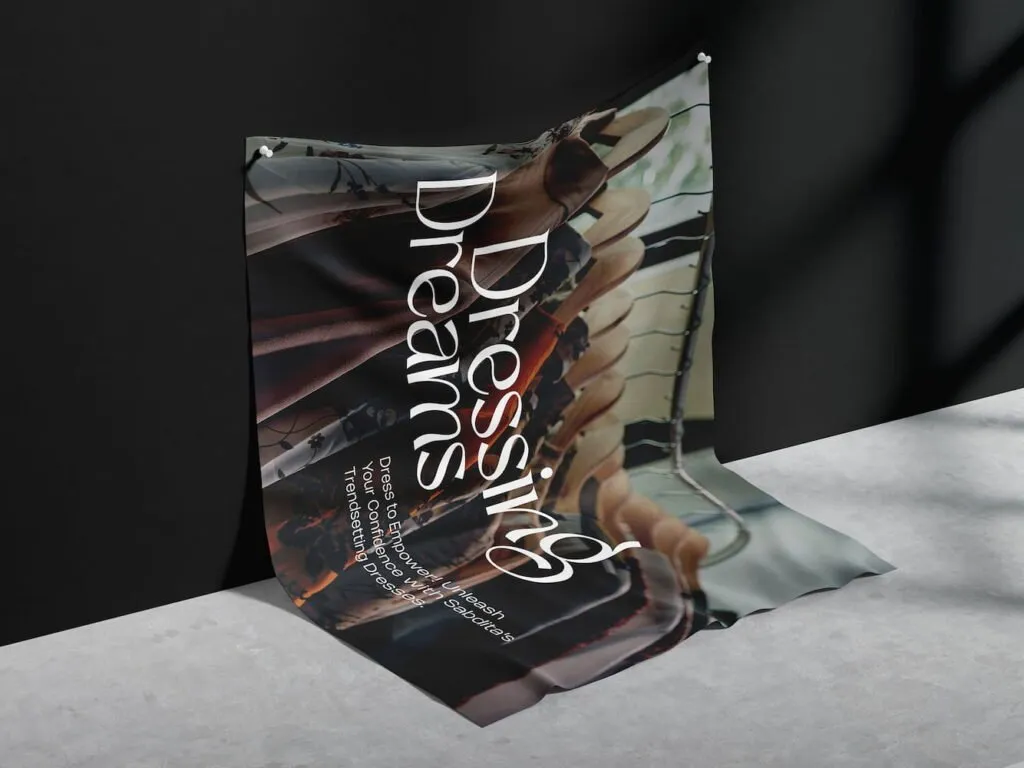
The portfolio also demonstrates “Dressing Dreams” as a supporting campaign phrase.
These messages provide useful direction for:
- Collection launches
- Social-media campaigns
- Packaging inserts
- Website banners
- Fashion photography
- Seasonal promotions
- Customer stories
- Outdoor advertising
- Video content
They should be organized within the guidelines as a primary tagline, secondary message, or campaign-specific copy so future use remains consistent.
Fashion Photography Direction
Photography provides the lifestyle and product context that the minimalist logo intentionally avoids.
The campaign imagery focuses on women wearing dresses in natural, editorial, and movement-led environments. Clothing, fabric, silhouette, and personal expression remain central to the composition.
This direction can support:
- New collection campaigns
- Product launches
- Seasonal promotions
- Website banners
- Social-media content
- Lookbooks
- Billboards
- Digital advertisements
- Catalogue covers
The logo remains restrained while photography introduces emotion, personality, and visual variety.
Logo Animation
Marketorr developed animated applications for the Sabdita Fashion identity.
The “S” and “F” elements can appear separately before joining to form the completed monogram. The brand name or message can then enter through controlled motion.
This sequence helps explain the logo concept while creating an asset for digital communication.
Logo animation can be used in:
- Social-media videos
- Collection announcements
- Website introductions
- Fashion reels
- Digital advertisements
- Product videos
- Campaign trailers
- Video end frames
The final animated frame remains consistent with the static logo, helping motion and print reinforce the same identity.
Thank-You Card Design
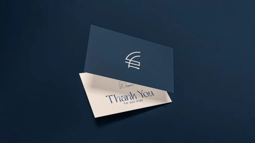
The rebranding system includes a customer thank-you card.
This creates a branded moment after the customer opens the package. It can also communicate care instructions, customer-service information, social-media details, or a request for feedback.
The card can include:
- A short thank-you message
- The brand logo
- Social-media information
- Website details
- Customer-care contacts
- Garment-care guidance
- A discount or referral code
- A review request
The design connects post-purchase communication with the broader brand identity.
Envelope Design
Marketorr applied the new identity to a branded envelope.
The envelope provides a structured format for invoices, customer notes, gift cards, order documents, and formal correspondence.
Its restrained layout keeps practical information readable while maintaining consistent logo placement, colour, and typography.
Fashion Packaging System
Packaging was developed as part of the rebranding rather than treated as a separate visual element.
The system demonstrates how the monogram, wordmark, colours, typography, and messages can operate across the physical customer experience.
Packaging applications include:
- Clothing boxes
- Shopping bags
- Wrapping materials
- Product inserts
- Delivery packaging
- Gift packaging
- Collection-specific packaging
A coordinated packaging system helps customers recognize the brand before seeing the garment itself.
Branded Ribbon
The Sabdita Fashion identity was applied to a repeating ribbon.
The monogram and brand name can be repeated across the material while maintaining sufficient spacing and legibility.
The ribbon can be used for:
- Product wrapping
- Packaging boxes
- Gift orders
- Shopping bags
- Collection launches
- Promotional displays
- Event materials
This application shows how the identity can extend from flat graphics into physical textile and packaging materials.
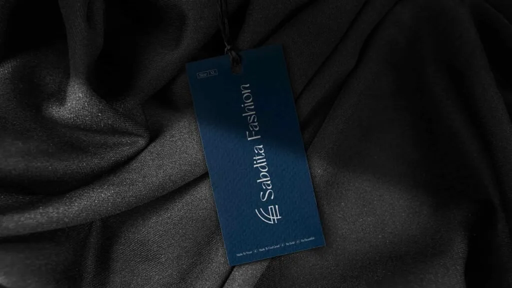
Hang-Tag Design
The hang tag places the identity directly on the product.
A fashion hang tag may need to communicate:
- Brand name
- Product or collection name
- Size
- Price
- Material information
- Care instructions
- Country of origin
- Barcode or SKU
- Website or social-media details
The monogram creates recognition, while the larger tag surface provides room for practical product information.
Shopping-Bag Application
Marketorr demonstrated the identity on branded shopping and product bags.
The simplified monogram remains visible from a distance, while the complete name helps new customers identify the business.
The bag also functions as a moving brand touchpoint after a purchase, extending visibility beyond the online store or delivery package.
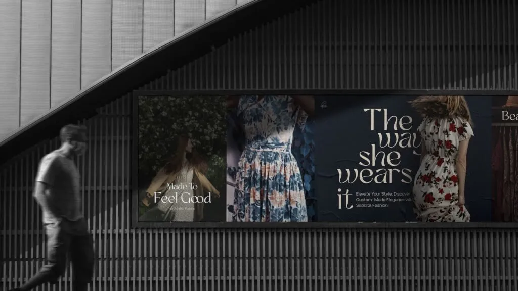
Billboard and Outdoor Advertising
The identity was presented within a large outdoor advertising format.
The billboard combines fashion photography, a concise message, and restrained logo placement. “Made To Feel Good” appears as the primary statement, while supporting layouts use “The way she wears it.”
The minimal composition is appropriate for outdoor communication because the main message and brand name can be understood within a short viewing period.
Billboard formats can support:
- New collection launches
- Seasonal campaigns
- Store announcements
- Eid campaigns
- Brand-awareness advertising
- Product-category promotions
- Event participation
The system allows campaign images to change while maintaining the same brand signature.
Social-Media and Campaign Applications
The rebranding provides a foundation for social-media communication built around fashion photography, brand messages, and consistent logo placement.
The system can support:
- Collection announcements
- Product launches
- Customer styling features
- Seasonal campaigns
- Behind-the-scenes content
- Customization information
- Fabric and craftsmanship stories
- Customer reviews
- Promotional offers
- Brand-introduction posts
A consistent monogram, colour environment, typography, and messaging style help individual posts remain connected even when photography changes.
Connected Customer Experience
Marketorr organized the logo, typography, colour direction, messaging, packaging, ribbon, hang tags, thank-you card, envelope, bag, billboard, campaign graphics, and animation into one connected system.
This creates consistency across the main stages of the customer journey:
- A customer encounters a campaign or social-media post.
- The logo and message introduce the brand.
- Product photography communicates the clothing style.
- Packaging continues the same visual language.
- The hang tag connects the identity with the garment.
- The thank-you card extends the experience after purchase.
- Future campaigns repeat the same recognizable visual elements.
The system gives designers and marketing teams a consistent foundation without requiring every collection to look identical.
The Final Outcome
The Sabdita Fashion rebranding created a clearer identity for a custom women’s clothing business.
The “S + F” monogram connects the mark with the company name. Its minimalist structure allows it to operate across garment tags, ribbons, boxes, shopping bags, printed materials, social-media profiles, campaigns, and animation.
The navy-led colour direction and refined typography support a clean, contemporary fashion position. Brand messages such as “Made To Feel Good” connect the products with confidence, comfort, and personal expression.
Packaging, thank-you cards, envelopes, ribbons, hang tags, billboards, campaign artwork, and motion demonstrate how the identity can remain consistent across both the purchase experience and wider marketing communication.
The result is a flexible visual identity designed to help Sabdita Fashion present its custom-made dresses through one recognizable fashion brand.