Brand guidelines are what keep a brand looking and sounding the same everywhere it shows up. As companies grow or work across different teams and channels, it gets easier for branding to slip or change.
According to Marq, around 90% of Marketers say they struggle with keeping their brand consistent. That’s where guidelines come in. They give everyone the same rules to follow, so the brand stays clear and familiar, no matter who’s working on it.
Good brand guidelines also save time. They cut down on back-and-forth and help people get things right the first time. Whether it’s a social post, an ad, or a presentation, everything feels like it came from one place. In today’s world, where people see brands in so many places, that kind of consistency builds trust and helps people remember who you are.
In this guide, you’ll learn what brand guidelines are and why they’re so important. We’ll cover the key parts of a good brand guide, including your brand’s mission, voice, logo usage, colors, fonts, and visuals. Then we’ll walk you through the steps to create your own brand guidelines, with tips to make them simple, easy to use, and ready to grow with your business.
What Are Brand Guidelines and Why Do They Matter?
Brand guidelines are the official rules for how your brand should be shown and shared, no matter where it appears.
They make sure everything that represents your brand like your logo, colors, voice, and photos, looks and sounds the same across all platforms. Whether it’s your website, social media, ads, or packaging, it should all feel like it came from the same place.
Why Brand Guidelines Exist
The reason brand guidelines exist is pretty simple: without them, your brand can easily get messy and confusing.
If every team or freelancer is creating content without clear rules, the final result can look totally different from one place to another. That’s when people stop recognizing your brand. And once that happens, they stop trusting it too.
A study by Lucidpress found that consistent branding across all channels can increase revenue by 33%. That’s not just design talk, that’s real impact. When people recognize your brand instantly, they’re more likely to remember it, trust it, and buy from you.
How Sticking to Guidelines Builds Trust and Makes Your Brand Recognizable
When your brand always looks and sounds the same, people start to recognize it quicker and trust it more.
Think about brands like Coca-Cola, Nike, or Apple. They don’t change how their brand looks every time they launch something. Their logos, fonts, colors, and even their voice stay the same. That consistency is why they’re so memorable.
The Key Parts of Good Brand Guidelines
And this isn’t just for big companies. Even small businesses or startups benefit from consistent branding. When people see the same visuals and tone across your Instagram, website, and emails, it feels more professional and trustworthy.
Good brand guidelines don’t need to be super fancy, but they do need to cover the basics clearly.
This section goes through the most important parts every brand guide should include, these are the building blocks of a strong, consistent brand.
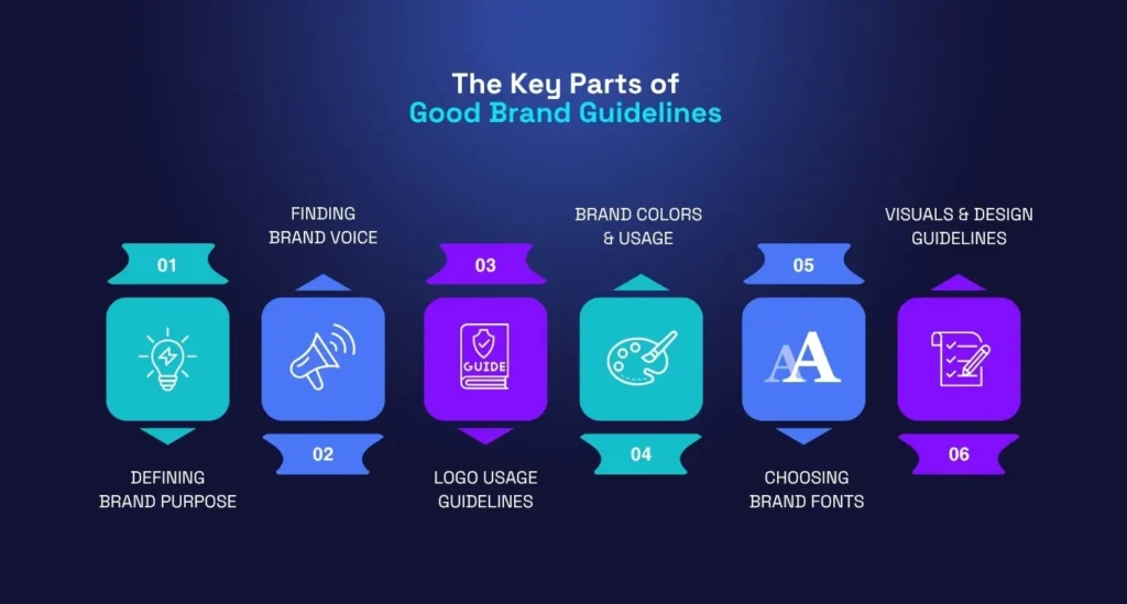
1. Defining What Your Brand Stands For: Mission, Vision, and Values
This part is all about explaining what your brand actually stands for and why it exists.
Your mission is what your brand is here to do right now. Your vision is what you hope to achieve in the future.
And your values are the beliefs that guide how your brand acts and makes decisions. All three help people understand what your brand is really about beyond just products or services.
If these things aren’t clear, your branding might look nice but it won’t feel meaningful or connected to anything deeper.
2. Finding Your Brand’s Unique Voice and Tone
Your voice is how your brand sounds when it communicates with people. The tone might change depending on the situation, but the voice stays mostly the same.
A playful, friendly brand might use casual language and emojis. A serious, professional one might speak more formally and stick to clear, direct messages. Either way, your voice should sound natural and match your audience. When done right, people will start recognizing your brand just by how you write.
Adding real examples like a sample social post or email helps make this part of your guide even more useful.
3. How to Use Your Logo the Right Way
Your logo is one of the most recognizable parts of your brand, so it’s important to use it correctly.
In your brand guide, explain how much space should be around it, what sizes are okay, where to place it, and what backgrounds it should or shouldn’t be on. Also include things like what not to do like stretching it, changing the colors, or placing it over a busy photo.
Even small changes can make your logo look wrong, and that affects how professional your brand feels.
4. Picking Your Brand Colors and How to Use Them
Your brand colors help people recognize your brand at a glance and they also affect how people feel about it.
List your main colors and any secondary ones, and include the HEX and RGB codes to keep things consistent across digital and print. You can also show how the colors should be used in different places, like backgrounds, buttons, or text.
Colors say a lot. Blue feels trustworthy, red feels bold, green feels fresh. Your palette should match your brand’s personality and stand out in your industry.
5. Choosing Fonts That Match Your Brand’s Personality
Fonts are easy to overlook, but they matter just as much as logos or colors.
Pick 1 or 2 fonts and make it clear when and where to use them for example, one for headlines and one for body text. Stick to clean, readable fonts that work well online and in print. Tools like Google Fonts make it easy to choose and share the right ones.
Your fonts should match the tone of your brand. A modern startup might use something sleek and minimal. A playful brand might go for something more rounded or creative.
6. Guidelines for Using Icons, Photos, and Other Visuals
Photos, illustrations, and icons all add extra style to your brand but they need to look like they belong together.
Your brand guide should explain what kind of visuals to use. Are your photos bright and natural or dark and moody? Should icons be flat or outlined? Do illustrations need to be simple or detailed?
You don’t need to include a thousand examples, just enough to show the overall vibe so your team knows what feels right and what doesn’t.
How to Create Your Brand Style Guide, Step by Step
Making your brand guidelines might feel like a lot at first, but once you break it down, it’s actually pretty doable. This section walks through each step clearly so you can build a solid guide from scratch or clean up what you already have.
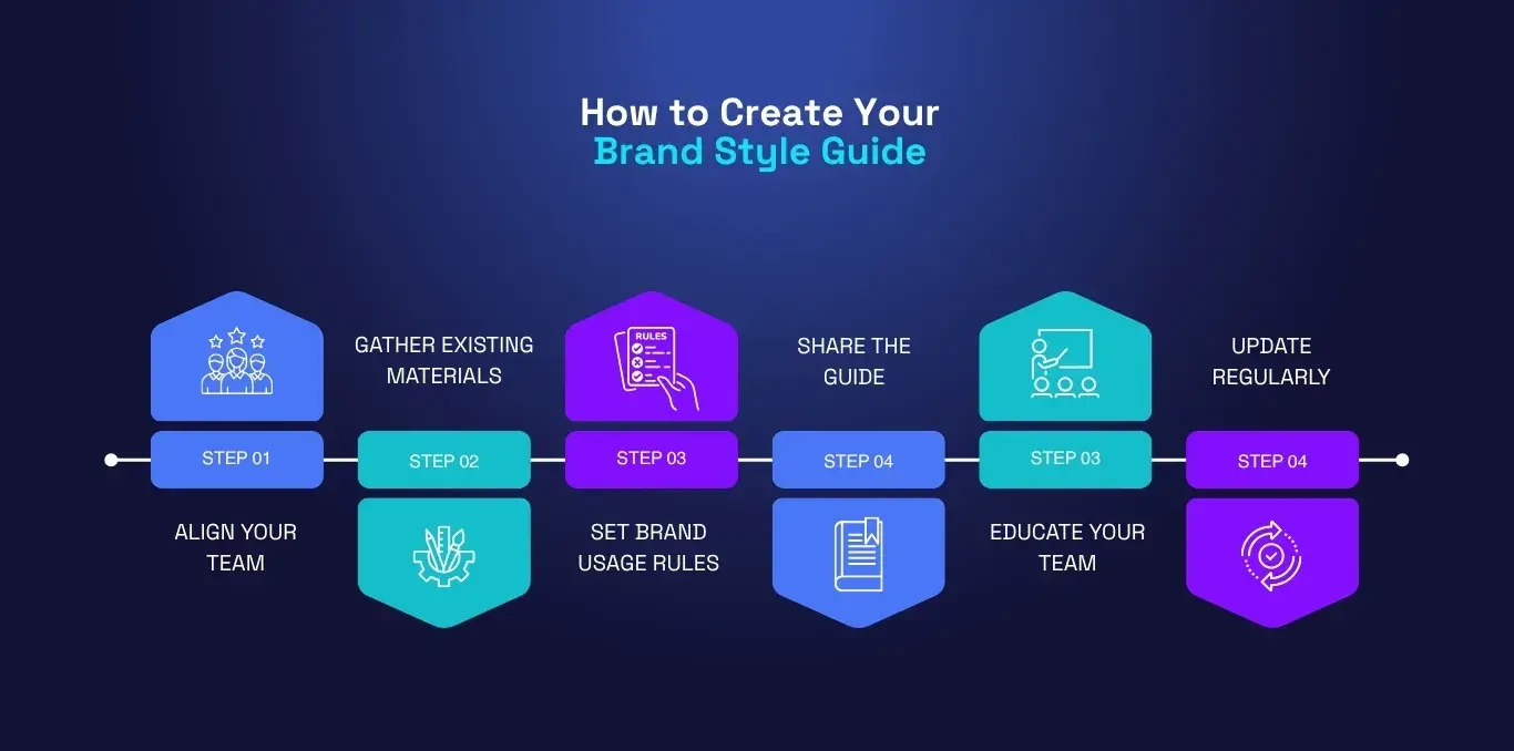
Step 1: Get Everyone on the Same Page About Your Brand
Start by getting your team together and talking about the core of your brand.
What do you stand for? Who are you talking to? What makes your brand different from others? These might sound like big questions, but they help shape everything else. It’s easier to build a guide when everyone agrees on the direction first.
This step matters because if your marketing team says one thing and your design team shows something else, your brand starts to feel confusing. A quick team session or survey can help lock in the basics.
Step 2: Gather All Your Existing Brand Materials
Before writing anything new, go find what you already have.
That might be your current logo files, fonts, old brochures, website screenshots, social posts, or anything else with your brand on it. Pull everything into one place, this helps you see what’s already consistent and what needs fixing.
Sometimes you’ll notice things like two different shades of the same color being used. Or maybe your logo has three different versions floating around. This is your chance to tidy that up before you build your new guide.
Step 3: Write Down Clear Rules on How to Use Your Brand
This is the heart of the whole thing, writing down how people should use your brand.
Keep it simple. Don’t make it sound like a legal document. Just say what to do and what not to do in normal words. For example, “Use this version of the logo on light backgrounds” or “Stick to these three fonts for everything.”
You don’t have to explain every little thing, but you should be clear enough that someone new can follow it without asking a bunch of questions. If you can, add visual examples to show what’s right and wrong.
Step 4: Pick the Best Way to Share Your Guide
Once your guide is ready, don’t just keep it on your laptop, share it somewhere easy to access.
It could be a PDF, a Notion page, a folder in Google Drive, or a link on your company’s intranet. Just make sure your team knows where it is and can open it anytime they need it.
If people have to dig through email threads or Slack messages to find the guide, they probably won’t use it at all.
Step 5: Teach Your Team How to Use It Properly
A guide is only useful if people understand how to use it. So spend a bit of time walking your team through it.
You don’t need a long training session, just a short intro call or a quick Loom video explaining what’s inside and why it matters. Let people ask questions too.
Once they get how to use the guide, your designers, marketers, and even freelancers will all start making content that feels way more consistent.
Step 6: Keep Your Guidelines Up to Date
Your brand won’t stay the same forever and that’s okay. Maybe you change your color palette, update your mission, or start using new social platforms.
When that happens, your guide needs to be updated too. Make a habit of reviewing it every few months or after a big change.
It doesn’t need a full overhaul, just keep it fresh and accurate. A living guide is always better than one that collects dust.
Tips for Making Your Brand Guide Easy to Use
Even the best guide won’t help much if it’s hard to read or confusing. This part covers how to keep things simple, clear, and actually helpful for the people who’ll use it.

Use Simple and Clear Language
Write the guide like you’re talking to a real person, not like you’re writing a textbook.
Say things the way you’d explain them to a coworker: “Use this version of the logo for print,” or “Don’t change the colors unless you check with the design team.” People don’t want to read long paragraphs full of buzzwords.
Simple language makes it easier for everyone to follow even people outside your creative team.
Show Visual Examples to Make Things Clear
A few good visuals can save you a lot of explaining. If you’re showing how to use the logo, add a few do’s and don’ts. If you’re talking about voice, show a real social media post.
When people see what the correct version looks like, they’ll remember it better and make fewer mistakes.
You don’t need to overdo it, just include enough to make things easy to follow.
Make Sure Everyone Can Access the Guide Easily
It’s not enough to just have a guide, it needs to be easy to find and use.
Put the link somewhere obvious, like your brand toolkit, your Slack pinned messages, or your company’s shared folder. If people can’t find it in under 30 seconds, they’ll probably skip it.
It also helps to keep a read-only version online so it doesn’t accidentally get edited or deleted.
Great Examples of Brand Style Guides
Sometimes the best way to understand how a brand guide works is to see one in action. These two brands do it well, each in their own style.
What We Can Learn from Mailchimp
Mailchimp’s brand guide is a great mix of personality and structure.
They use a bright yellow color, fun illustrations, and a voice that feels casual but smart. Their guide doesn’t just say “use this font”, it explains the feeling behind their choices. Even their rules feel creative.
It’s a great reminder that your guide doesn’t have to be boring. You can keep it fun, as long as it stays clear.
How Uber Keeps Their Brand Consistent
Uber’s style guide is super clean and straight to the point just like their brand.
They focus on things like logo use, map design, spacing, and typography. Everything is explained in a very organized way, which makes sense for a brand that focuses on efficiency and clarity.
Uber shows that a brand guide doesn’t need a lot of fluff, it just needs to be well thought out and easy to follow.
Tools and Resources to Help You Make Your Brand Guidelines
You don’t need to build your brand guide from scratch with just a blank doc and a guess. There are plenty of tools and resources out there that can help you create something clean, organized, and easy to manage.
This section will walk you through the best platforms and free templates that make the whole process smoother.
Best Platforms for Managing Brand Assets
Once your brand guide is ready, you’ll need a place to store it and share it with your team. These tools are built for exactly that.
- Frontify is a popular option for teams that want to keep their brand assets, guidelines, and templates all in one place. It’s easy to update and great for sharing with agencies or partners.
- Brandfolder is another solid pick, especially for bigger companies. It helps you organize your logos, images, fonts, and more and makes sure people are always using the latest versions.
- Notion is also great if you want something simple and flexible. You can build a custom brand guide page and include all your visual rules, downloads, and links in one clean place.
Using a tool like this means you’re not sending your logo file over email every other day. Everything stays up to date, in one place, and easy to find.
Free Templates and Guides You Can Download
If you’re just getting started or want a little boost, there are lots of free templates online to help you build your guide.
Websites like Canva, Figma, and HubSpot all offer free brand guideline templates that you can copy and edit. They usually include sections like logo usage, color palettes, typography, and voice.
These templates give you a good starting point, and you can always tweak them to match your own brand style. Just make sure you’re not copying the design of the template too closely if you want your guide to feel original.
FAQs About Brand Guidelines
Still have a few questions? That’s normal. A lot of people aren’t sure how detailed their brand guide should be or how often it needs to change.
Here are some of the most common questions people ask about brand guidelines—answered in plain language.
How Detailed Should My Brand Guide Be?
Your brand guide should be detailed enough that someone outside your team can understand and follow it.
It doesn’t need to be a 100-page book, but it also shouldn’t be so vague that people are left guessing. Focus on the core elements first, logo, colors, fonts, voice, and visuals. Then add more detail as needed.
If you’re working with partners, freelancers, or remote teams, more detail is usually better.
Can Brand Guidelines Change Over Time?
Yes, they definitely can and they should. Your brand will grow, evolve, and maybe even shift direction a bit. That’s totally normal. As things change, your guide should change with it. Maybe you add new colors, change your tone, or redesign your logo.
Just make sure any updates are shared clearly with your team so everyone’s on the same page.
What’s the Difference Between Brand Guidelines and a Style Guide?
Good question these terms get mixed up a lot.
Brand guidelines usually cover the full picture of your brand: mission, tone, logos, visuals, and more. A style guide often focuses more on writing, things like grammar rules, voice, tone, and formatting.
You can think of the style guide as one part of the bigger brand guideline. Some companies include both in one document. Others keep them separate. Either way is fine, as long as they’re clear.
Need Help Creating Brand Guidelines That Actually Work?
If all this feels a bit overwhelming or you’re just not sure where to start, that’s okay. At Marketorr, we create brand guidelines for businesses to build clear, no-nonsense brand guidelines that actually make things easier for teams.
No jargon. No overcomplicated stuff. Just something useful your whole team can follow.
Need a hand? Let’s chat and see how we can help.
Final Thoughts
A strong brand isn’t just about how your logo looks; it’s about how your whole brand shows up, speaks, and feels across every single touchpoint.
That’s why brand guidelines matter. They help you stay consistent, build trust, and make sure your team is always on the same page. Whether you’re just starting out or you’ve been around for years, it’s never too early (or too late) to put a brand guide in place.
And remember, it doesn’t need to be perfect right away. Start simple. Build what you need now. Then keep updating as your brand grows.