A logo is one of the most important parts of a brand because it helps people recognise and remember a company. It’s like a visual shortcut that shows what the business is about. A good logo makes a brand look trustworthy and professional.
It can make a big difference in standing out, especially when there are so many choices out there. People tend to remember images faster than words.
That’s why a clear and simple logo is key. It needs to work well everywhere, from websites and social media to packaging and signs. Having a strong logo helps companies build a connection with customers and makes their brand easier to spot in a crowded market.
By the end of this guide, you will understand how to create or commission a logo that effectively represents your brand, stands out in the market, and connects with your target audience.
What is Logo Design?
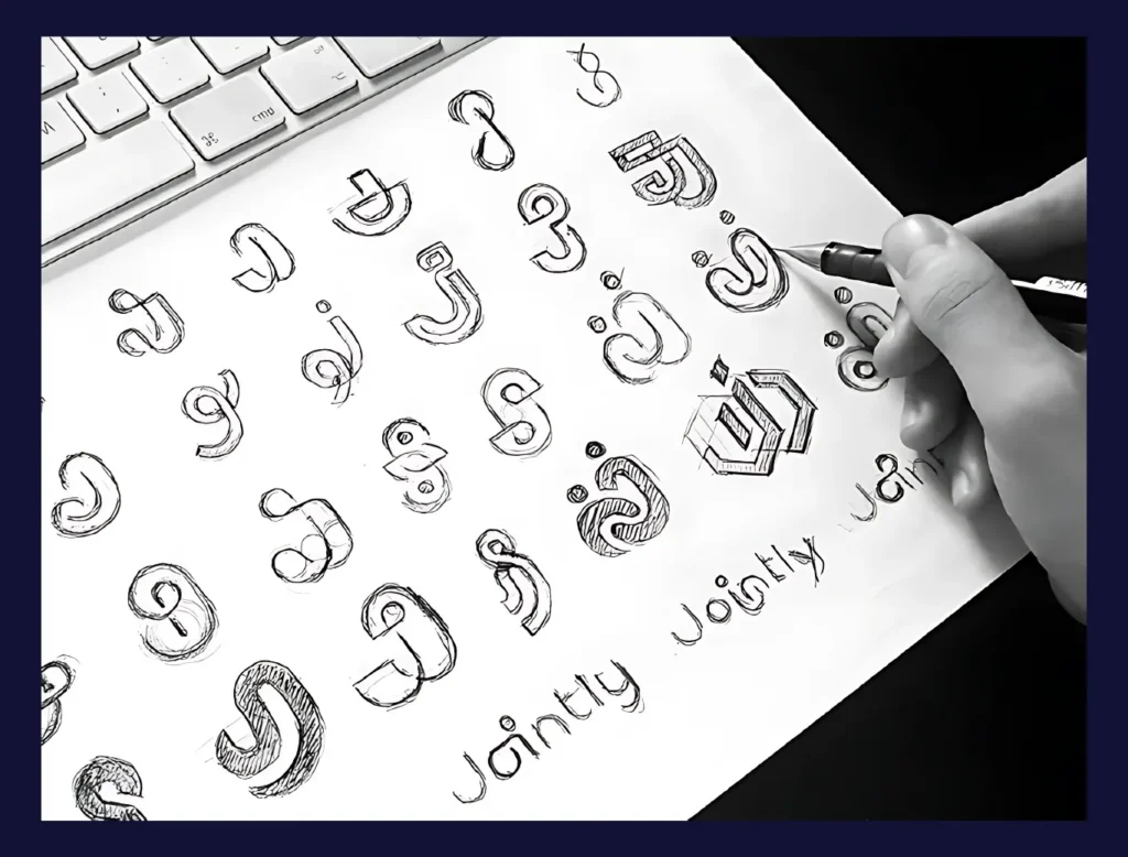
Logo design refers to the process of creating a unique and recognizable graphic mark that represents a company, product, or service. It typically involves combining symbols, typography, colors, and shapes to craft a visual identity that is easy to identify.
At its core, a logo acts as the face of a brand. It is often the first thing potential customers notice and remember. Effective logo design ensures that this first impression is positive, conveying trust, professionalism, and brand personality.
The process of logo design goes beyond aesthetics; it requires understanding the brand’s values, market positioning, and audience preferences. A well-designed logo can increase brand recognition by up to 80%, according to several marketing studies, making it an indispensable part of any business strategy.
Why Logo Design Matters for Your Business and Brand Identity
A logo is much more than a decorative element. It is a strategic tool that helps businesses communicate their identity quickly and clearly. For many companies, a logo is the cornerstone of their branding efforts.
Strong logos enhance brand recall, improve customer loyalty, and differentiate a company from its competitors. In fact, research from the Journal of Brand Management reveals that consistent use of logos across platforms can boost revenue by up to 23%.
Moreover, logos convey emotional messages.
They build trust and credibility, which influences purchasing decisions. Brands with well-crafted logos are perceived as more reliable and professional. This perception impacts how consumers relate to the brand and whether they choose it over others.
Logos also play a critical role in digital marketing and social media, where visual impact is essential to capture attention in crowded feeds.
The Essential Elements of Logo Design
Effective logos combine several core elements that work together to create a cohesive and powerful visual identity. These elements include color, typography, symbols, and sometimes taglines or text.
Color Psychology and Its Impact
Color influences human emotions and behaviors significantly. In logo design, choosing the right colors can evoke specific feelings and associations.
For example, blue often symbolizes trust and professionalism, which is why it’s popular in finance and healthcare industries. Red conveys energy and urgency, commonly used in the food and entertainment sectors.
Studies have shown that color increases brand recognition by up to 80%, making it a vital consideration. Colors must also work well in black and white to ensure versatility across different media.
Typography
Typography in logos defines the brand’s voice and tone. Whether a font is modern, traditional, playful, or serious affects how the brand is perceived. For instance, sans-serif fonts often appear clean and modern, while serif fonts convey tradition and reliability.
Font choice must balance readability and uniqueness. A custom font or a well-chosen typeface can make the logo distinctive and memorable.
Symbols, Icons, and Imagery in Logos
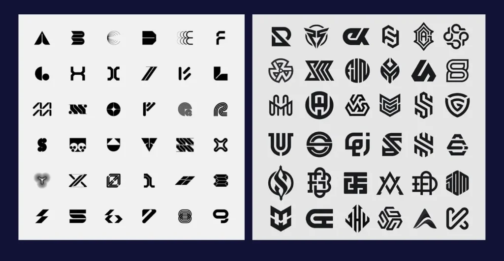
Symbols and icons serve as shorthand for the brand’s identity. They can be abstract or literal, but should always be relevant to the brand’s core message. Famous logos like Apple’s apple or Nike’s swoosh show how a simple icon can create instant recognition.
The imagery should be scalable and legible at different sizes, maintaining clarity whether on a business card or a billboard.
The Role of Taglines and Text Elements
Sometimes logos include taglines or additional text to clarify what the brand stands for. While not always necessary, a tagline can enhance messaging, especially for new or lesser-known brands.
However, the text should never overshadow the logo’s main visual components. It must be concise and easily readable in small formats.
Common Types of Logos and How to Choose the Best One
When it comes to logos, there isn’t a one-size-fits-all solution. Different types of logos serve different purposes depending on your brand’s identity, name, and how you want people to remember you.
Wordmark Logos
Wordmark logos focus entirely on the brand’s name, using custom fonts and styling to make it unique. This style highlights the company name itself, making it the star of the show. Brands like Google, Coca-Cola, and Visa have mastered this approach.
Wordmark logos are especially useful when your brand name is short and distinctive. Because the name is front and center, it’s easier for customers to remember and recognize the business.
Lettermark Logos
Lettermark logos simplify things by using only the initials or acronyms of the brand name. Think of IBM, CNN, or HBO. These are great options if your company’s full name is long, complicated, or not easy to recall. Using just the letters keeps the logo clean and straightforward.
Lettermarks help with quick recognition, especially for companies that want a sleek, minimal look. They fit well in small spaces and can be quite memorable if the lettering style is unique.
The downside is that if your brand is new or not widely known, people might not immediately connect the initials to the full company, so it might require some extra marketing.
Combination Marks
Combination marks blend a text element with a symbol or icon. Brands like Adidas, Burger King, and Lacoste use this style to create logos that are both flexible and memorable.
This type of logo gives you the best of both worlds: a recognizable symbol that can stand alone, plus the brand name for clarity. It works well in various settings because you can use just the icon where space is tight, or the full logo when you want to reinforce the brand name.
Combination marks require thoughtful design to balance the text and symbol so neither overshadows the other. They can be a little more complex to create, but they offer great versatility.
Brand Marks
Brand marks are logos that rely solely on symbols or icons without any text. Examples include Apple’s apple, Twitter’s bird, or the Nike swoosh. These logos are powerful because they are simple, unique, and instantly recognizable worldwide.
For a brand mark to be effective, the company usually needs to have established strong brand awareness. Since there are no words, the symbol itself has to carry all the meaning and evoke the right feelings.
Brand marks are versatile and easy to use across many platforms and sizes. But if your brand is new or lesser-known, starting with just a symbol can be risky because people might not know what it represents right away.
Key Principles and Best Practices in Logo Design
No matter what type of logo you choose, there are some important principles that help ensure your logo looks great, lasts over time, and truly represents your brand.
Simplicity and Scalability
Simplicity is one of the most important rules in logo design. A simple logo is easier to remember and looks clean across different sizes and formats. When logos have too many details, they tend to get lost or look messy, especially when shrunk down to fit on business cards or mobile screens.
Scalability means your logo should look good whether it’s tiny or huge. The Nike swoosh is a perfect example, and it’s simple enough to be clear on a small shoe label but bold enough to stand out on billboards.
Keeping your logo simple also helps it stay timeless. Trends come and go, but simple designs tend to age better.
Versatility Across Different Platforms
Your logo will appear everywhere: on your website, social media profiles, merchandise, printed ads, and more. It needs to adapt to all these different spaces seamlessly.
That means your logo should work in color and black-and-white, and on both dark and light backgrounds. Having multiple versions of your logo ensures you always have the right fit without losing impact.
Versatility also means thinking about how your logo looks on digital and physical products. For instance, it should be legible on a tiny phone screen and look great on a giant banner.
Staying Unique: Avoiding Generic Designs
A unique logo sets your brand apart. If your logo looks like everyone else’s, it will be hard for customers to remember you or feel a connection.
Doing research on competitors helps you avoid common clichés and overused symbols. Your logo should reflect what makes your brand special and tell your story visually.
Originality builds trust and loyalty because customers recognize that your brand is different and authentic.
Testing Your Logo for Different Sizes and Uses
Before finalizing your logo, test it in all the places it will be used. Does it look clear and balanced on a website header? How about on a tiny social media profile picture? What about printed on a pen or embroidered on clothing?
Testing helps catch issues early so you can adjust details and make sure your logo stays strong everywhere. It also ensures consistency, which is key to building brand recognition.
How to Approach the Logo Design Process
Creating a logo isn’t just about making something that looks nice. It’s a strategic process that involves understanding your brand and your audience deeply. This section breaks down how to approach logo design from start to finish.
Defining Your Brand Goals and Audience
The first step in designing a logo is to clearly define what your brand stands for and who you want to reach.
Your brand goals include your mission, values, and the message you want to send. Knowing your target audience helps make design choices that connect with the right people.
For example, a logo for a children’s toy brand will use bright colors and playful fonts, while a law firm’s logo might be more traditional and professional. When your logo reflects your brand goals and audience preferences, it feels authentic and resonates better.
Researching Competitors and Market Trends
Before sketching or designing, researching your competitors’ logos and current market trends is essential. This helps you avoid copying others and find ways to stand out. It also shows you what styles or colors are common in your industry.
If every competitor uses blue logos, you might choose a different color palette to differentiate your brand. Staying aware of trends ensures your logo feels modern but still unique.
Collaborating with Designers vs. DIY Options
Many people wonder whether they should hire a professional designer or create a logo themselves. Both have pros and cons.
Professional designers bring expertise, creativity, and an objective eye, which often results in a stronger logo. However, DIY tools and apps have improved and can be a good choice for startups or those on a budget.
If you choose DIY, it’s crucial to learn basic design principles and be ready to revise your logo as your brand grows. Hiring a designer is often worth the investment if you want a polished and unique identity from the start.
Frequently Asked Questions About Logo Design
This section answers common questions to clear up confusion and help you make informed decisions about logo design.
How Long Does It Take to Design a Logo?
The time to design a logo varies widely based on complexity, research, and feedback. Some logos can be created in a few days, while others take weeks or months. Professional designers often spend several rounds refining concepts before final approval. Rushing the process risks ending up with a logo that doesn’t fully capture your brand.
Can I Update or Rebrand My Logo Later?
Yes, logos can be updated or completely redesigned. Many successful brands refresh their logos over time to stay relevant or reflect changes in their business. However, frequent changes can confuse customers, so it’s best to plan carefully and maintain some consistency.
What File Formats Should I Get?
When you receive your logo, ask for multiple file formats. Vector files like SVG or AI are crucial because they can scale without losing quality. PNG files are useful for web use with transparent backgrounds. Having these formats ensures your logo looks sharp everywhere, from business cards to billboards.
Conclusion
A well-designed logo is a powerful tool for building your brand identity and connecting with your audience. It’s not just about looks but about clear communication, memorability, and versatility.
Understanding the essential elements, types of logos, and key design principles sets a strong foundation. Approaching the logo design process thoughtfully, backed by research and clear goals, increases your chances of success.
Remember, your logo will represent your brand for years to come. Taking the time to create a meaningful and unique logo pays off in customer trust, brand recognition, and business growth.
Hire Marketorr to create a professional Logo for your business to make your brand more clean and professional

